So I have been thinking of ways to communicate the value of a new fraud model to stakeholders. A data scientist working in fraud detection might produce an ROC curve. Perhaps plot the ROC curve against some benchmark model’s and tell stakeholders, “Hey, look this model dominates the output from the benchmark. We should implement this model.” They might even compute the area under the curve and say this is how good the model is…0.86. Not too shaby.
Here’s the thing. What makes sense for data people, doesn’t necessarily translate to an executive people. They need the information in ways that they can digest. How much fraud are we going to stop? How many alerts are we going to generate? What will the false positive ratio of those alerts be?
The ROC curve contains much of the information on false positives and true positives that the executive would need to make their decisions. It is just technical and jargony. So let’s translate it into an equivalent plot that the executive team will understand. Most risk managers and executives will understand Value-at-Risk and number of alerts generated, so let’s do a deep dive on these topics, and then we’ll take a look at how these two metrics trade off of each other.
Value-at-Risk
The value at risk in fraud land is based on the number of fraud incidents that you think that you will experience, and the severity of those incidents. From this information, you can calculate what your losses are likely to be. So, if you know for example, that on average you experience 30 incidents of fraud per period of time, and that the average loss on those 30 incidents is $100, then you can say, on average you will lose $3000 per period. However, that is not how good fraud executives think about losses.
They are in the business of managing risk. What they are interested in, is the tail risk. They want to know the answer to the question, “How bad can it get?”
That’s where value-at-risk comes in as a good measure of risk. It is specifically designed to look at the extreme risk. It specifically looks at the risk in the tail of a distribution, not the average. It tries to answer the question of, “how ugly could it get out there?”

It is defined by three attributes, a time-period, the confidence level, and a loss amount. The time period could be a month, a quarter, a day, or possibly a year. The confidence-level is usually expressed as a percentage. The idea is that you are have a certain level of confidence that the dollar amount you will lose will be no worse than this amount with some level of probability. The loss amount is the dollar amount that is at risk, it is the amount that should be planned and budgeted. The goal should be to reduce the value at risk. Decreasing this dollar amount would represent a decrease in total risk.
ROC Curves
The goal of building a fraud detection algorithm is to stop fraud from occurring. The machine learning model is a control for the fraud risk. So the idea is that the model should be good at catching fraud. The ROC curve measures how successfully the model can detect fraud. The basic idea is that for a given threshold the ROC curve will map out your true positive rate, and the false positive rate. The ideal machine learning model will have a 100% detection rate with no false positives. The worst possible machine learning model will just have random guessing. A machine learning model that has nothing but false positives is just as useful as a perfect machine learning model, just flip the labels.
The curve looks something like this:

So for a given level of detection we visualize the trade-off that the model is giving us. The way to read this chart is we choose how many false positives we want to look at. From 0% of the total number of false positives to 100% of the total number of false positives. We choose that percentage, and the chart will tell us what percentage of the true positives that we will see. In the chart above, we can detect aboout 20% of the true positives with almost zero false positives.
Linking Them Together
So this is the trickiest part of the process. Naturally, there is likely some control in place and we are not coming into the fraud problem cold. We therefore need to know what our current detection true positive rate is. This will be important for deciding how many cases of fraud actually exist, as there may be cases that exist that go undetected.
The basic trick will be to utilize the false positive and true positive rates traced out by the ROC curve, in conjunction with the current detection rate. From the false positive rate, you can determine how many alerts that you will generate. Likewise from the true positive rate, you can derive what your new value at risk is going to be. So instead of looking at an ROC curve, you can think of them as alerts to value-at-risk.
Here’s how the math works out.
E[Alerts(t)]=n(π⋅TPR(t)+(1−π)⋅FPR(t)).
Where t is the threshold value, and TPR and FPR are the true positive and false positive rates at that threshold. The value π, is the probability of fraud. So the estimated number of alerts is simply the number of transactions multiplied by the probability of fraud times the true positive rate plus the probability of being legit multiplied by the false positive rate. This will tell you the total number of alerts that you should expect to generate.
The value-at-risk measure is a little bit trickier. This is because we will need to simulate the losses and loss distribution. We do this by taking the probability of fraud, and generating a loss amount given the expected number of frauds that go undetected.
n(π⋅(1-TPR(t)))
We sum up the losses for each of these draws and that becomes the total loss for that simulation run. We repeat this a number of times, say m times, and then we calculate the 95th percentile for these m simulations.
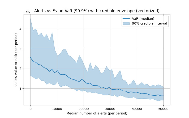
The final step is to calculate this for every point on the ROC curve. If one does this, they will have the number of expected alerts, and Value-at-Risk for each threshold. In so doing you can draw out the chart.
I add a final complication. I add a Bayesian model on top of the loss distributions that I use to calculate and simulate the loss distributions driving the value at risk. The code follows at the end of the article, but this is just so that I can compute a credible interval around my value-at-risk numbers since that is the squishiest part of my analysis.
If you do it right, you should end up with a figure such as this:

Note this curve should be monotonically decreasing, it doesn’t because of the random fluctuations due to the simulation. The only other thing that you may be interested in is whether some value makes sense. You may want to plot the differenced curve (i.e. the marginal value at risk per alert) against the marginal cost of adding an employee to work additional alerts. That would tell you a lot about what the optimal number of alerts should be.
    import numpy as np
    import pymc as pm
    import matplotlib.pyplot as plt

    # ---------------------------
    # USER INPUTS (replace these with your data)
    # ---------------------------
    counts = np.array([30, 10, 20, 40, 20, 50, 30, 20])
    T = len(counts)

    losses = np.array([1200., 500., 4000., 200., 750., 6000., 300., 2100., 900., 45., 5000., 800., 250., 60.])
    event_period = np.repeat(np.arange(T), repeats=np.maximum(counts, 0))[: len(losses)]
    if len(event_period) != len(losses):
        event_period = np.zeros(len(losses), dtype=int)

    roc_fpr = np.linspace(0.0, 0.5, 50)
    roc_tpr = 0.9 * (1 - np.exp(-4 * roc_fpr))
    hist_idx = 10
    N_tx = 100000

    n_draws = 1500
    n_tune = 1500

    # Posterior-MC settings:
    M = 100   # number of outer MC reps (was 1000 in your code)
    rng = np.random.default_rng(123456)

    TPR_hist = float(roc_tpr[hist_idx])
    FPR_hist = float(roc_fpr[hist_idx])

    # ---------------------------
    # PyMC v5 model (unchanged)
    # ---------------------------
    with pm.Model() as model:
        mu_base = pm.Exponential("mu_base", lam=1.0)
        alpha_nb = pm.HalfNormal("alpha_nb", sigma=5.0)
        log_mu_X = pm.Normal("log_mu_X", mu=5.0, sigma=3.0)
        sigma_X = pm.HalfNormal("sigma_X", sigma=2.0)

        mu_obs_counts = mu_base * (1.0 - TPR_hist)
        counts_obs = pm.NegativeBinomial("counts_obs", mu=mu_obs_counts, alpha=alpha_nb, observed=counts)
        X_obs = pm.Lognormal("X_obs", mu=log_mu_X, sigma=sigma_X, observed=losses)

        trace = pm.sample(draws=n_draws, tune=n_tune, target_accept=0.92)

    posterior = trace.posterior

    def flatten(x):
        arr = x.values
        return arr.reshape(-1, *arr.shape[2:])

    mu_base_s = flatten(posterior["mu_base"]).squeeze()    # shape (S,)
    alpha_nb_s = flatten(posterior["alpha_nb"]).squeeze()  # shape (S,)
    log_mu_X_s = flatten(posterior["log_mu_X"]).squeeze()  # shape (S,)
    sigma_X_s = flatten(posterior["sigma_X"]).squeeze()    # shape (S,)
    S = mu_base_s.shape[0]

    # ---------------------------
    # Vectorized posterior predictive simulation (fast)
    # ---------------------------
    roc_points = len(roc_tpr)
    median_alerts = np.zeros(roc_points)
    VaR_999_median = np.zeros(roc_points)
    VaR_999_low = np.zeros(roc_points)
    VaR_999_high = np.zeros(roc_points)

    # For memory safety: we'll iterate over ROC thresholds (usually ~50), but everything inside is vectorized:
    for idx in range(roc_points):
        TPR = float(roc_tpr[idx])
        FPR = float(roc_fpr[idx])

        # 1) Sample baseline rates lambda and baseline counts N_base for all M x S in one call
        #    shape: (M, S)
        # Use gamma-poisson mixture: lambda ~ Gamma(shape=alpha, scale=mu/alpha)
        # Broadcast alpha_nb_s and mu_base_s across M rows
        alpha_rep = np.broadcast_to(alpha_nb_s[None, :], (M, S))
        mu_rep = np.broadcast_to(mu_base_s[None, :], (M, S))
        lam_base = rng.gamma(shape=alpha_rep, scale=(mu_rep / alpha_rep))   # (M, S)
        N_base = rng.poisson(lam=lam_base)  # (M, S), integer baseline fraud counts

        # 2) True positives (TP) among baseline frauds and undetected frauds
        # vectorized binomial: draws for each element (M,S)
        # numpy.binomial supports array inputs
        TP = rng.binomial(n=N_base, p=TPR)           # (M, S)
        undetected = N_base - TP                     # (M, S)

        # 3) False positives (FP) from non-fraud population
        nonfraud = np.maximum(N_tx - N_base, 0)      # (M, S)
        FP = rng.binomial(n=nonfraud, p=FPR)         # (M, S)

        # 4) Alerts matrix (M, S)
        alerts = TP + FP                             # (M, S)

        # 5) Severities: for each (m,s) we need sum of 'undetected[m,s]' lognormal draws
        #    Vectorize by drawing up to max_undetected across the (M,S) grid and using a mask.
        max_u = int(undetected.max())
        if max_u == 0:
            # no undetected events anywhere -> trivial
            loss_draws = np.zeros((M, S), dtype=float)
        else:
            # Draw samples shape (M, S, max_u). We draw by generating an array where
            # the lognormal parameters vary across s (posterior samples) and are constant across M.
            # We'll construct two arrays for broadcasting:
            #   log_mu_X_s: shape (S,)
            #   sigma_X_s: shape (S,)
            # We want an array of shape (M, S, max_u) with the per-s parameters repeated across M and max_u.
            mu3 = log_mu_X_s[None, :, None]          # (1, S, 1)
            sigma3 = sigma_X_s[None, :, None]        # (1, S, 1)
            # Draw (M, S, max_u)
            sev_samples = rng.lognormal(mean=mu3, sigma=sigma3, size=(M, S, max_u))
            # Build mask: for each (m,s), keep first undetected[m,s] samples
            # undetected[:,:,None] shape -> (M,S,1); arange shape (max_u,)
            idxs = np.arange(max_u)[None, None, :]   # (1,1,max_u)
            mask = idxs < undetected[:, :, None]     # boolean (M,S,max_u)
            # Sum masked severities along axis=2
            loss_draws = np.sum(sev_samples * mask, axis=2)   # shape (M, S)

        # 6) For each MC rep m we now have S loss draws; compute 99.9% percentile across S
        #    This gives one VaR estimate per MC rep (shape M,)
        #    Use interpolation='higher' to be conservative if you prefer; default np.percentile is fine.
        var_draws = np.percentile(loss_draws, 99.9, axis=1, interpolation='linear') if hasattr(np.percentile, '__call__') else np.percentile(loss_draws, 99.9, axis=1)

        # 7) Summarize
        # median number of alerts: take median across entire (M,S) ensemble
        median_alerts[idx] = np.median(alerts)
        # VaR distribution across MC reps (var_draws) -> summarize median & 5/95 percentiles
        VaR_999_median[idx] = np.median(var_draws)
        VaR_999_low[idx] = np.percentile(var_draws, 5)
        VaR_999_high[idx] = np.percentile(var_draws, 95)

    # ---------------------------
    # Plot with credible envelope
    # ---------------------------
    plt.figure(figsize=(8, 5))
    plt.plot(median_alerts, VaR_999_median, color="C0", label="VaR (median)")
    plt.fill_between(median_alerts, VaR_999_low, VaR_999_high, color="C0", alpha=0.3, label="90% credible interval")
    plt.xlabel("Median number of alerts (per period)")
    plt.ylabel("99.9% Value At Risk (per period)")
    plt.title("Alerts vs Fraud VaR (99.9%) with credible envelope (vectorized)")
    plt.legend()
    plt.grid(True)
    plt.show()

    # ---------------------------
    # Staffing cost calculation
    # ---------------------------
    salary = 80000        # annual cost per analyst
    alerts_per_hour = 5
    hours_per_year = 2000
    alerts_per_analyst = alerts_per_hour * hours_per_year  # 10,000

    # Assume each "period" = 1 month
    periods_per_year = 1

    staffing_costs = []
    for alerts in median_alerts:
        annual_alerts = alerts * periods_per_year
        n_staff = np.ceil(annual_alerts / alerts_per_analyst)
        staffing_costs.append(n_staff * salary)
    staffing_costs = np.array(staffing_costs)

    # ---------------------------
    # Plot with staffing cost overlay
    # ---------------------------
    fig, ax1 = plt.subplots(figsize=(8, 5))

    # Primary axis: VaR
    ax1.plot(median_alerts, VaR_999_median, color="C0", label="VaR (median)")
    ax1.fill_between(median_alerts, VaR_999_low, VaR_999_high,
                     color="C0", alpha=0.3, label="90% credible interval")
    ax1.set_xlabel("Median number of alerts (per period)")
    ax1.set_ylabel("99.9% Value At Risk (per period)", color="C0")
    ax1.tick_params(axis="y", labelcolor="C0")

    # Secondary axis: staffing cost
    #ax2 = ax1.twinx()
    ax1.step(median_alerts, staffing_costs, where="post",
             color="C1", label="Staffing cost")
    ax1.set_ylabel("Annual staffing cost ($)", color="C1")
    ax1.tick_params(axis="y", labelcolor="C1")

    # Legends
    lines1, labels1 = ax1.get_legend_handles_labels()
    #lines2, labels2 = ax2.get_legend_handles_labels()
    # ax1.legend(lines1 + lines2, labels1 + labels2, loc="upper left")

    plt.title("Alerts vs Fraud VaR with Staffing Costs")
    plt.grid(True)
    plt.show()

Leave a Reply